QuickBooks Online left navigation menu test
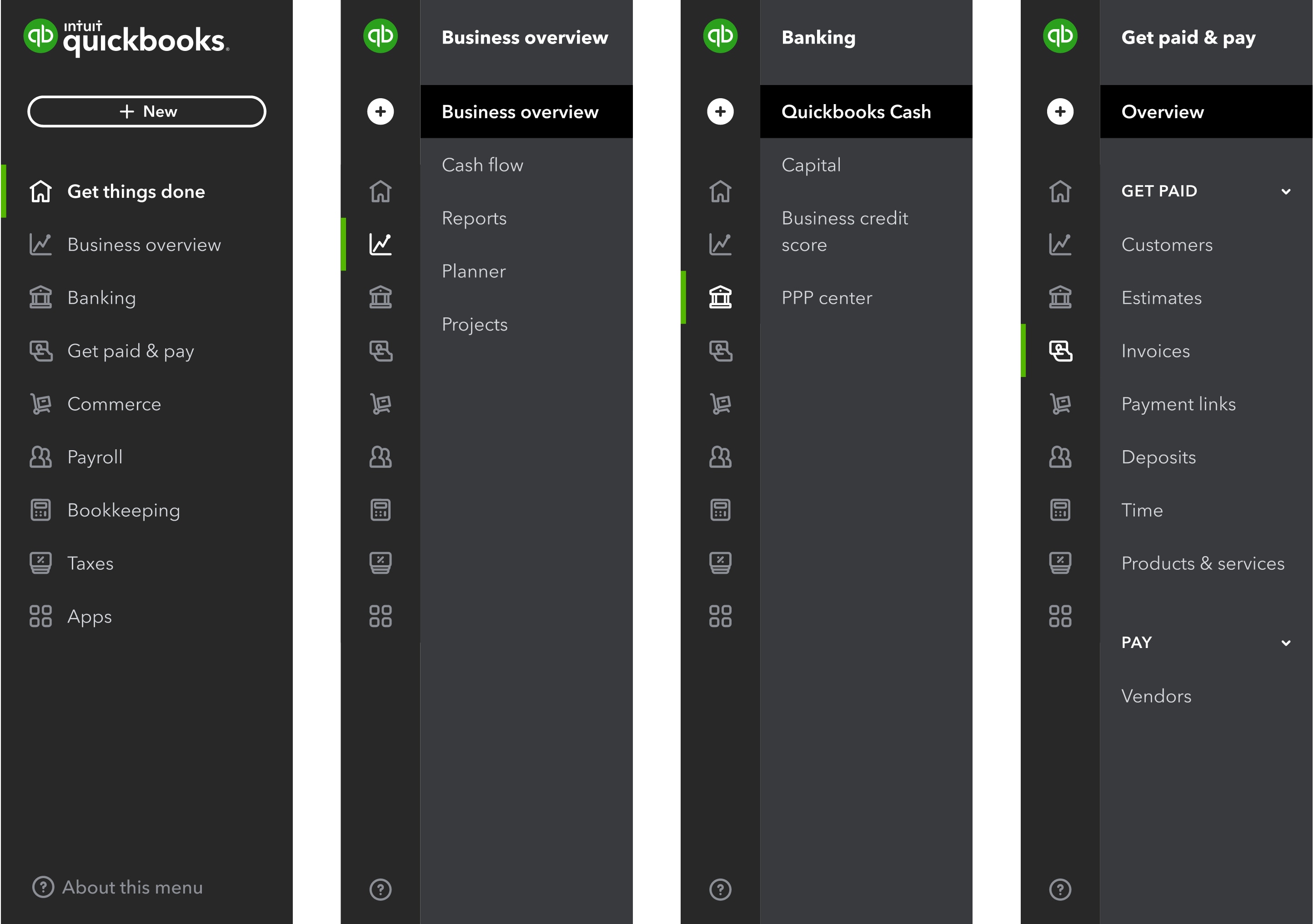
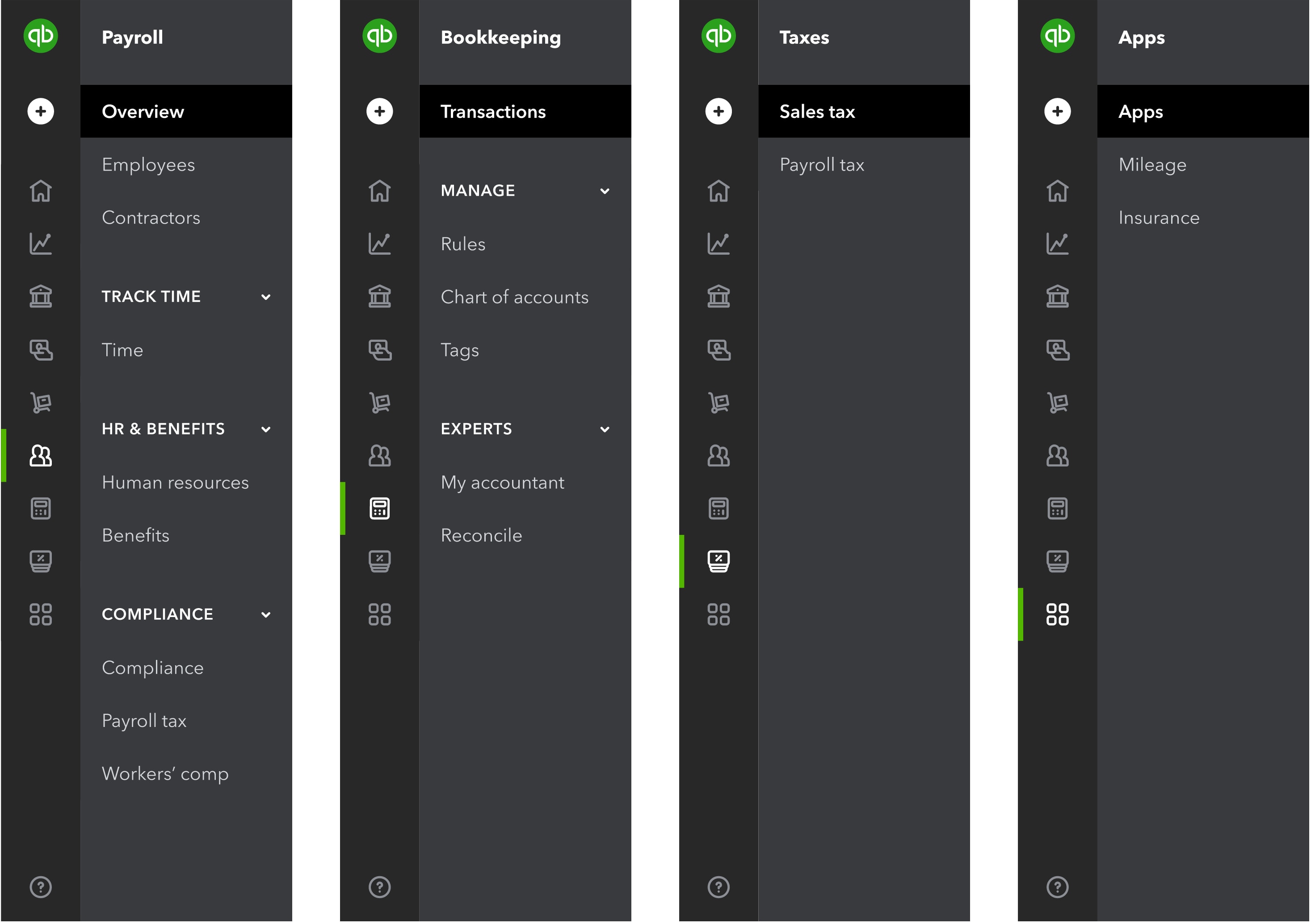
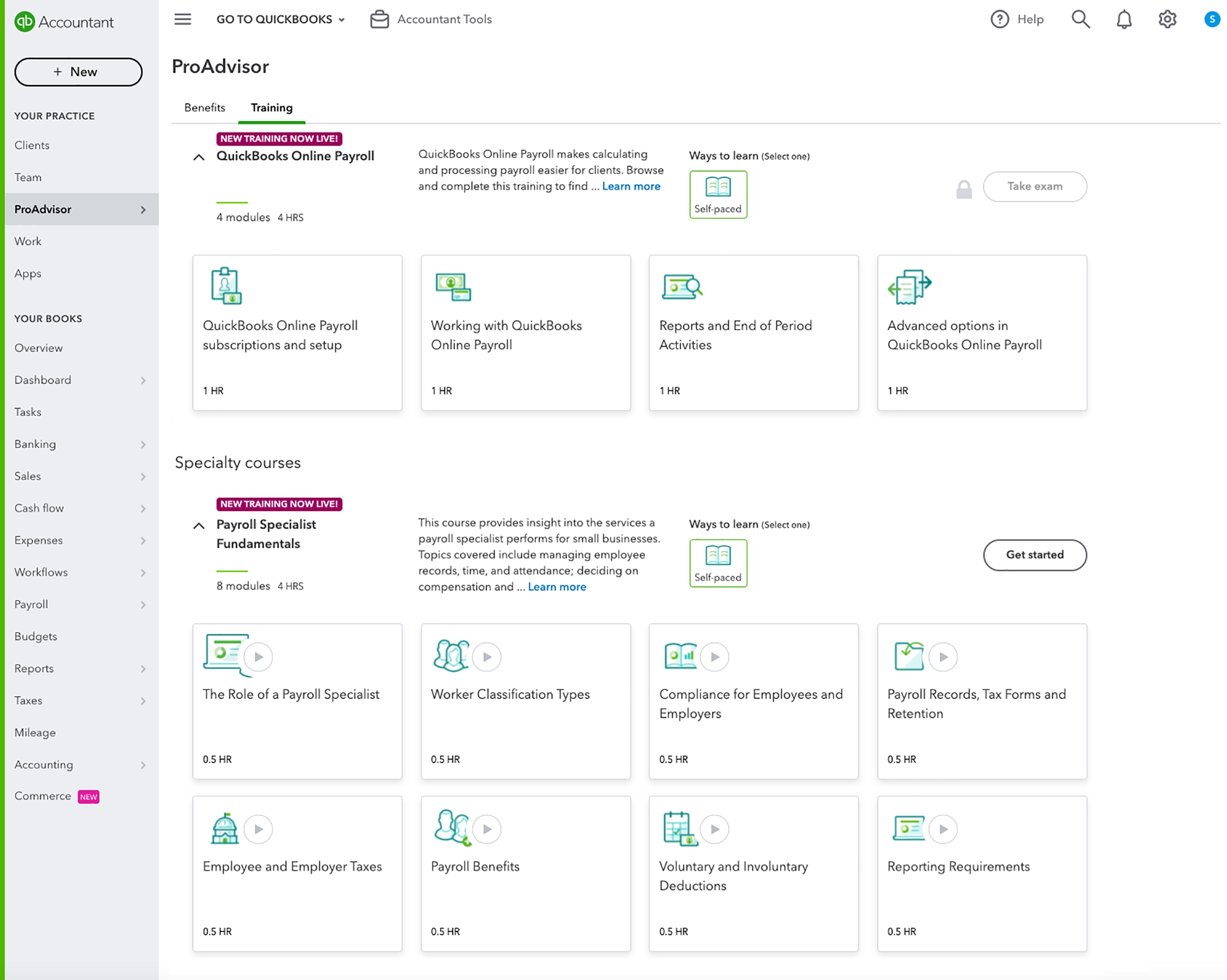
In a nutshell: To help small business owners find what they need more quickly and easily, we’re testing a reorganized left navigation menu with a portion of new QuickBooks Online customers. The consolidated menu and new terminology are accessible by selecting Business View from the account settings.
Why are we making these changes?
We’ve heard from new QuickBooks Online customers that it’s hard to find what they need quickly because the navigation has too many options. We’ve designed the new navigation based on customers’ feedback, recommended terminology and groupings, and tasks they’ve told us they’re trying to complete. We rely on testing to ensure that we’re improving the experience before broadly making a change.
As business owners increasingly turn to QuickBooks to solve more business needs – from money movement and worker management, to coordinating e-commerce and financial planning – it is our goal to ensure they can easily and effectively run their business.
What’s different?
The simplified navigation includes new terms like Business overview, which groups cash flow, reports, planner, and projects – and Get paid & pay, which groups vendors, sales, and time. All of the same pages and workflows are available, but the way your client might access them has changed. Additionally, similarly to the original experience, the QuickBooks Live Expert Assisted tab is only visible to customers who are not connected to an accountant.
If you or your client would like to work with the old navigation instead of the consolidated test version, select Accountant View in settings. Here are more detailed instructions on how to switch your view.
If you have any feedback on this experience, please let us know.
