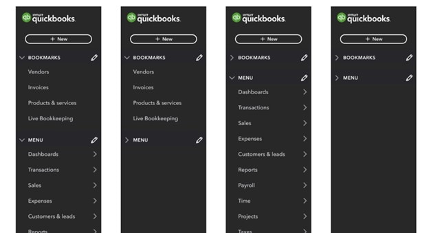
Last year, we updated the Business View navigation menu in QuickBooks Online so your clients could more easily access the capabilities they need, in the language they use, and stay focused on growing their business.
We’ve since heard from accounting professionals that working with clients who are using a different navigation path can be difficult and frustrating; the completely different menu makes it challenging to provide guidance to clients.
What’s changing?
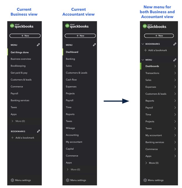
To simplify navigation for accounting professionals and businesses, we’ll transition to one new, consolidated left navigation menu based on the Accountant View. This includes the following:
- Redesigning the Accountant View menu to be better organized and easier to scan.
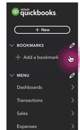
- Moving bookmarks to the top of the menu, making them easier to access.
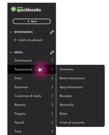
- Keeping the “hover and flyout” menu interaction, so you can see all of the sub-menu items when you hover over the main menu item.
- Updating the QuickBooks Accountant left navigation menu to reflect many of the same renaming and reordering changes. For example, “Banking” will change to “Transactions.”
When will the new, single navigation be available in QuickBooks?
The change to move all users to one updated left navigation menu will happen in two phases:
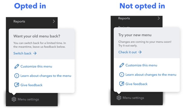
- Phase one will be an “opt-in” period where you can try out the new navigation menu and provide feedback about how it works for you. You’ll be able to choose which view to use; the software will not automatically default to the new view. During this period you will also have the option to go back to the current menu.
- During phase two, we’ll gradually roll-out the new menu to all users. You’ll still have the ability to toggle between Business View and Accountant View using the gear menu, but the navigation will not change. In Business View, the accounting language and names of some features and buttons may differ from that in Accountant View. We’re working toward using the same language in both views.
- We’ll alert you in advance—in your QuickBooks product—before each phase begins.
Below, see some of the ways the navigation menu is changing, and what you’ll see during the transition to the new navigation.
Menu settings during the opt-in period:

