It’s the end of the month. You just closed the books and it’s time to prepare your next financial report. You read my article on the importance of data visualization, and you want to be a better host of this financial information so your readers can engage with it.
First, tell a compelling story
Just like our favorite books and TV shows, the compelling storylines are the ones that grab our attention. Our financial information is no different. In the visualization world, we find the most engaging stories are ones that:
Raise an alarm:
- A sudden drop in revenue.
- Cash reserves falling below set thresholds.
- Expenses higher than expected.
Trumpet a success:
- Surpassing a revenue goal
- Reducing accounts receivable days’ turnover.
Recommend action:
- Explore additional financing or line of credit usage.
- Examine product pricing to cover additional costs of staffing.
In my work advising nonprofits at YPTC, I regularly meet with clients to understand their pain points and determine the questions that are central to their financial sustainability. I use these as the basis for my chart design.
If you are not sure where to start finding your stories, here are five questions you could consider the next time you review a client’s financial information:
- What has changed significantly? This month? This year?
- What are the trends emerging from the data?
- What caused the changes?
- How far are we from our goals? Do we need to make any adjustments?
- Are there recurring questions and how does this new data inform the answer?
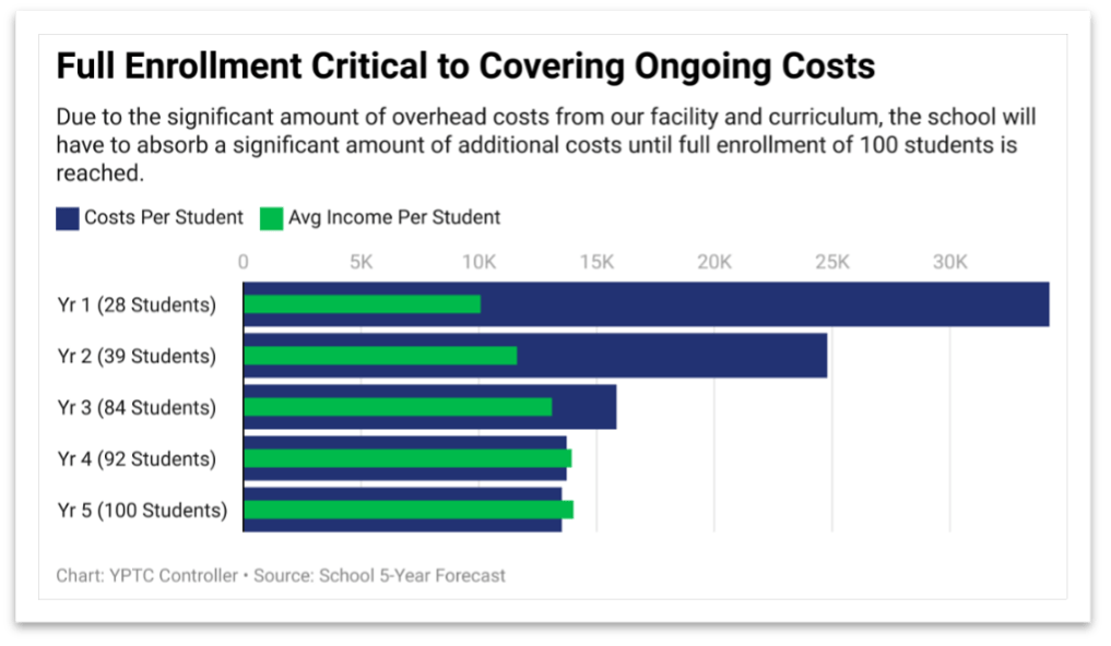
When you have decided which story you want to tell, the next step is to make sure you have some evidence to support your story. It needs to be measurable and quantifiable. While you need numbers, you also need comparisons. A number alone does not make a good story. Let’s say a business made $100,000 in income this year. That is one number, but when compared to something such as last year’s income, which was $1 million—now I have a story. This is the beginning of a good chart!
Pick the right shape for your chart
Every type of chart serves a different purpose and not all of them are equal. Knowing the function of each chart will help you pick the best one to tell your story.
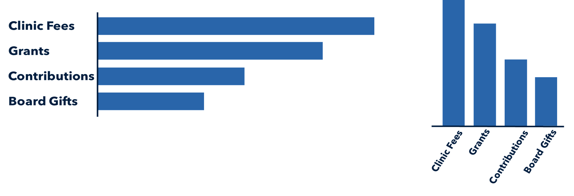
Bar charts
Great for: When you compare two or more pieces of data.
Common use cases: Budget vs. actuals, year-over-year comparisons, category comparisons.
When to use: Bar charts are the workhorse of the data visualization world because they are great at explicitly comparing values by magnitude. The longer the bar, the bigger the magnitude. Whether horizontal or vertical, their shape is something our eyes quickly understand, which is why they are so common and helpful.