Get low-complexity clients from books to taxes faster 
QuickBooks Ledger enables accountants to easily create a trial balance for tax filing.
The art of charts: How data visualization turns info into insight.
Productivity

The art of charts: How data visualization turns info into insight

As accountants, we spend a lot of time tracking and ordering financial information. However, the clients and organizations we serve need us to do more than this; they need our help in making sense of it. It’s kind of like if you were to host a dinner party to share your delicious recipe. You spend days crafting and preparing the meal. The doorbell rings. Your guests have arrived. But you look around and the house is a mess. Even the finest meal does not taste as good in this setting.

Information works the same way. Whatever role you play in your firm, the way you work with clients, or asked to sit on a board and put your financial hat on, you are tasked with delivering your special dish: Insights you have discovered from your work that can help inform business decisions. Your guests—whether it’s the executive team, internal staff, or anyone else—need the table set to receive your insights.

I’ve had to hone this craft in my role advising nonprofits at YPTC. We regularly work with our nonprofit clients to present their financial information to a wide variety of audiences, including boards, funders, and the communities they serve, all in ways that can be easily understood.

Our organizations need us to be good hosts of the data

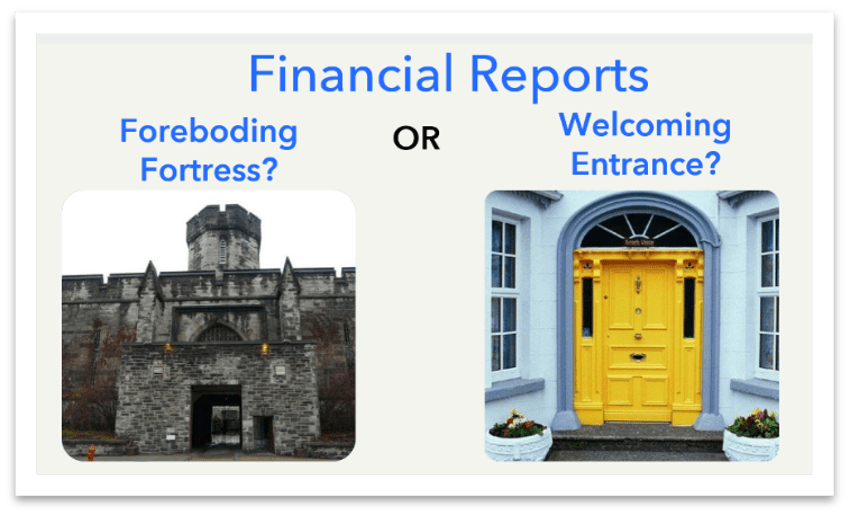
A good host recognizes the effort it takes for a visitor to make it to our door and come inside. This applies to accounting as well. For many audiences receiving our reports, information found on standard financial statements can feel like a foreboding fortress: intimidating and difficult to decipher. Our readers may be reluctant to engage with our work and ask questions. In addition, they are short on time and mental capacity. They need all the help they can get.

The art of charts: How data visualization turns info into insight.

Our deliverables should invite our readers in and welcome engagement. That is where data visualization can really help. An intentionally designed graphic can tell a compelling story that helps our readers engage, question, and act on the information.

I want to share three examples that illustrate how you can transform a standard report into an invitation for engagement.

Example 1: Dense tables of financial data

The art of charts: How data visualization turns info into insight.

In this first example, you see a table with a lot of information: multiple expense accounts and several points of comparison. It is difficult for my reader to know what to focus on.

Imagine that I want to help my readers answer a recurring question: “How are our expenses compared to budget?” A chart can help illustrate this quickly. You can see this in the example below.

The art of charts: How data visualization turns info into insight.

With minimal effort, this bullet bar chart tells the story of the numbers. I can see right away that we are significantly under budget for personnel and over budget for facilities. These charts are easy to understand because they make comparisons explicit and put numbers into context.

Visualizing and simplifying this information fast tracks my reader to understand my dense table of data.

Example 2: Dense month-end memo on cash flow

The art of charts: How data visualization turns info into insight.

This is a typical month-end memo an accountant wrote for their organization. The densely packed paragraph takes time to read and even more time to understand. After a few minutes of reading, you will hopefully see that the business’s cash is becoming perilously low.

This type of report is a prime example of how poorly hosted data can lead to dangerous results. Critical information could be overlooked due to substandard presentation. This is a great example of how a chart could help us host this information better.

The art of charts: How data visualization turns info into insight.

To transform this memo, I chose a line chart to show the change in cash over time. With this chart, my reader can see the important story in just a few moments. I used color and labels to point my reader to the critical information, and included a helpful headline and description to fill in the details. Now my readers can spend time engaging with the urgent cash situation rather than trying to wade through my dense words.

Example 3: Revamping a pie chart to get more meaning 

Simply including a chart does not necessarily mean you are hosting your data’s story well. This next example illustrates this.

Take a look at this pie chart. Without any additional information, can you tell which demographic of pie chart users is the biggest? Probably not! Why is this the case?

The art of charts: How data visualization turns info into insight.

First off, the 3D feature distorts the shapes and brings an unnecessary distraction. You can set those 3D features on the shelf with the other relics from the past. Pie shapes are terrible at helping your eyes make meaningful comparisons between different segments of the whole. There are better ways to do this. Let’s give this pie chart a more appetizing makeover.

The art of charts: How data visualization turns info into insight.

Assuming that my goal is to compare these different groups of people, I would be better off converting this to a bar chart. Because bar charts are great at comparing subtle differences, it’s easier to find my answers. And to be clear, there are times when pie charts make sense—for example, when you need to compare one part to the whole—but not in this case. We’ll explore that more in our next article.

Why visualizing data matters

Visualizing our data is not just a nice addition to your work as an accountant. It’s essential. When we bury our invaluable work in dense reports and tables, our readers cannot engage with it, ask questions about it, or make meaningful decisions from it. This is a disservice to the hard work you have put in, and it is a disservice to the leaders who need your insights to inform their business decisions.

Every time you transform a dense report into a clear visualization, you are not just sharing data; you are empowering decisions. Imagine if your clients were able to immediately spot that crucial trend, a board instantly understood that critical variance, or your team immediately asked the right strategic questions.

That is the power of well-visualized, well-hosted data. It turns information into insight, and insight into action.

Be sure to read the second part in this series, "The art of charts: Choosing the right chart to tell your story," as well as part three, “The art of charts: Keeping your clients engaged month after month.”


Recommended for you

Get the latest to your inbox

Get the latest product updates and certification news to help you grow your practice.

By clicking “Submit,” you agree to permit Intuit to contact you regarding QuickBooks and have read and acknowledge our Privacy Statement.

Thanks for subscribing.

Relevant resources to help start, run, and grow your business.

Looking for something else?

Get QuickBooks

Smart features made for your business. We've got you covered.

Tax Pro Center

Expert advice and resources for today’s accounting professionals.

QuickBooks Support

Get help with QuickBooks. Find articles, video tutorials, and more.

How can we help?
Talk to sales 1-800-497-1712

Monday - Friday, 5 AM to 6 PM PT

Get product support