Accountants know this scenario: You spend days closing the books and preparing a client’s financials. Maybe you send it to them only to learn it sits on a shelf, never to be read or discussed. Or perhaps you prepare a presentation, but it goes off track, with participants focused on obscure questions and details, rather than critical information.
In our first two articles, we explored the value of being good hosts of our information, and why our audience needs us to set the table for them so they can engage with our work. We learned tips on choosing a compelling data story and picking the right chart.
The next challenge we face is that we need to do this repeatedly.
How do we prepare our charts in a way that keeps our readers focused on what is important and engaged with our content on an ongoing basis? They need our help.
Keeping focus
Our clients, aka readers, are short on time and attention, yet too often, our visualizations get cluttered with unnecessary details that divert our readers’ focus. As good hosts, we need to do whatever we can to be singular in our story’s purpose so that we do not “bury the lead.”
How do you do this?
Remove irrelevant data. In your efforts to remain singular, be relentless about removing any data that does not focus your reader on your main story.
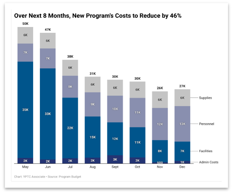
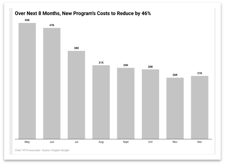
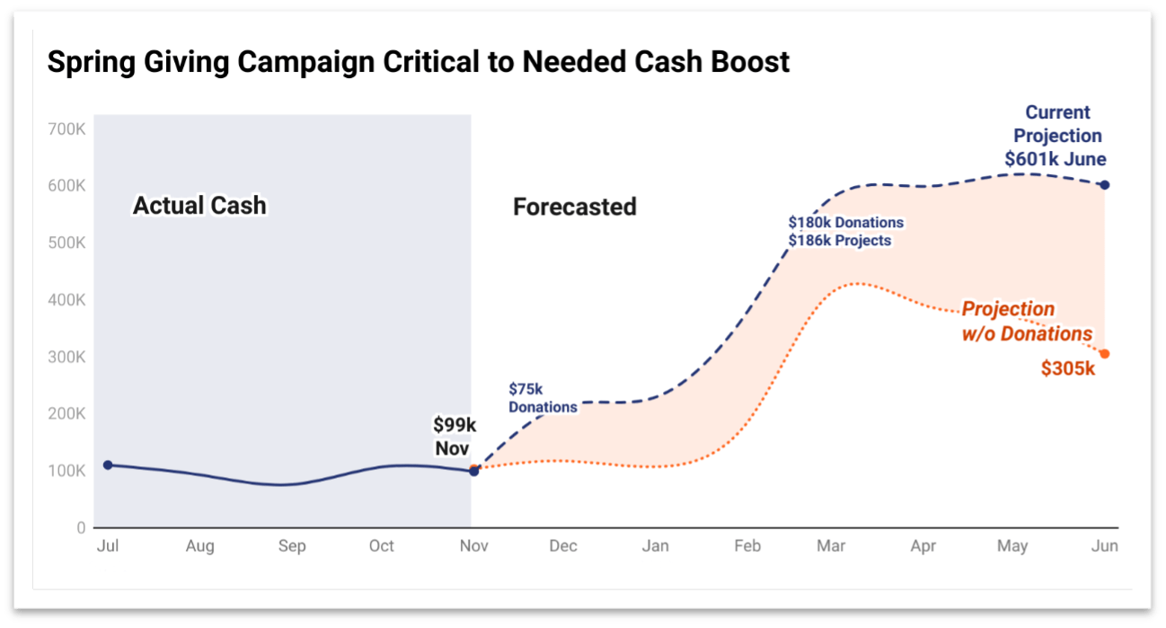
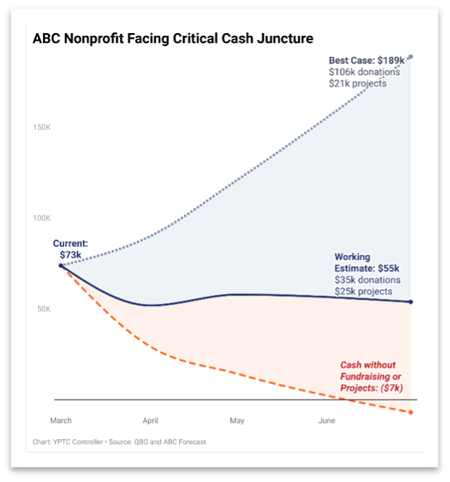
Here are two charts with the same headline. Which one is better?